
UI Enhancements
dsh-plugins#dsh-mobile-ui
TZHR-invest/dsh-plugins/packages/dsh-mobile-ui · ★ 3
 TZHR-invest
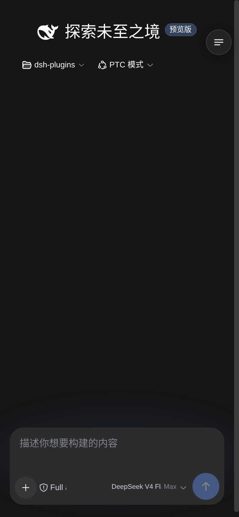
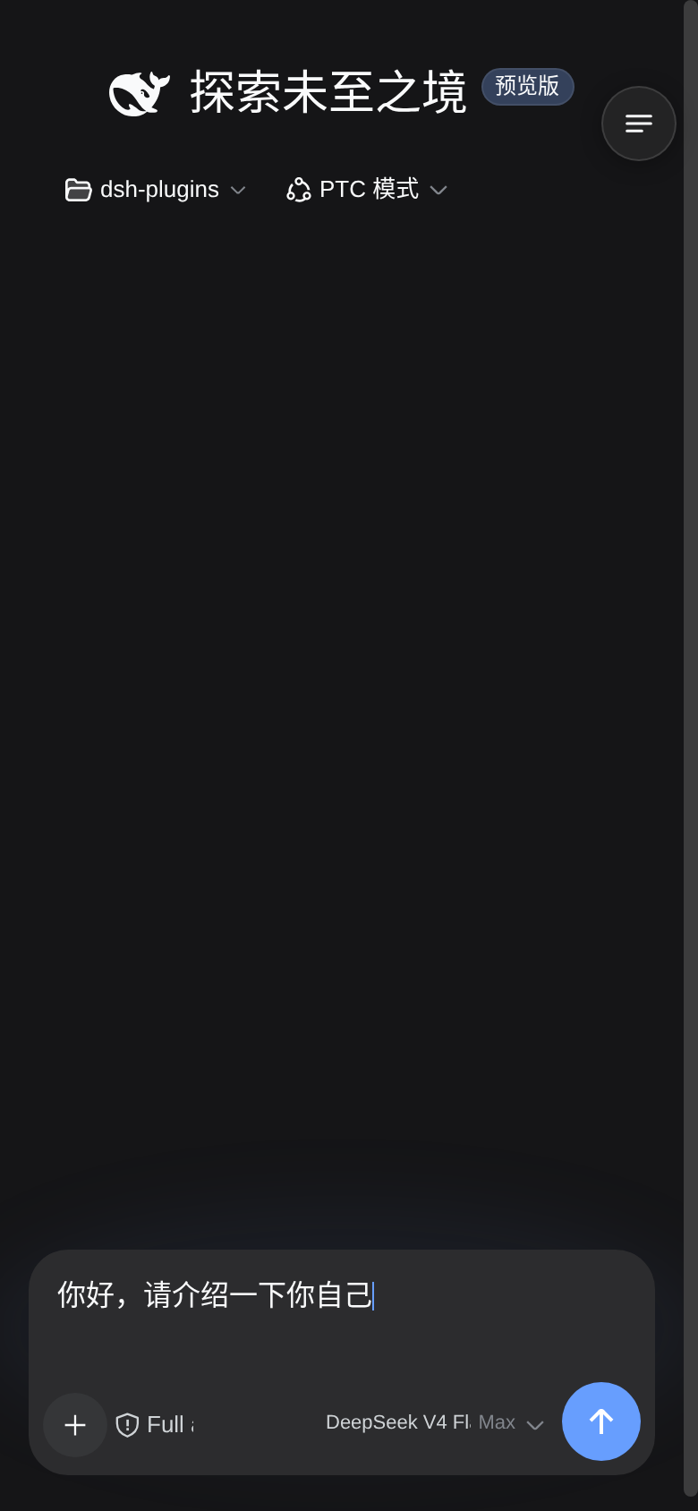
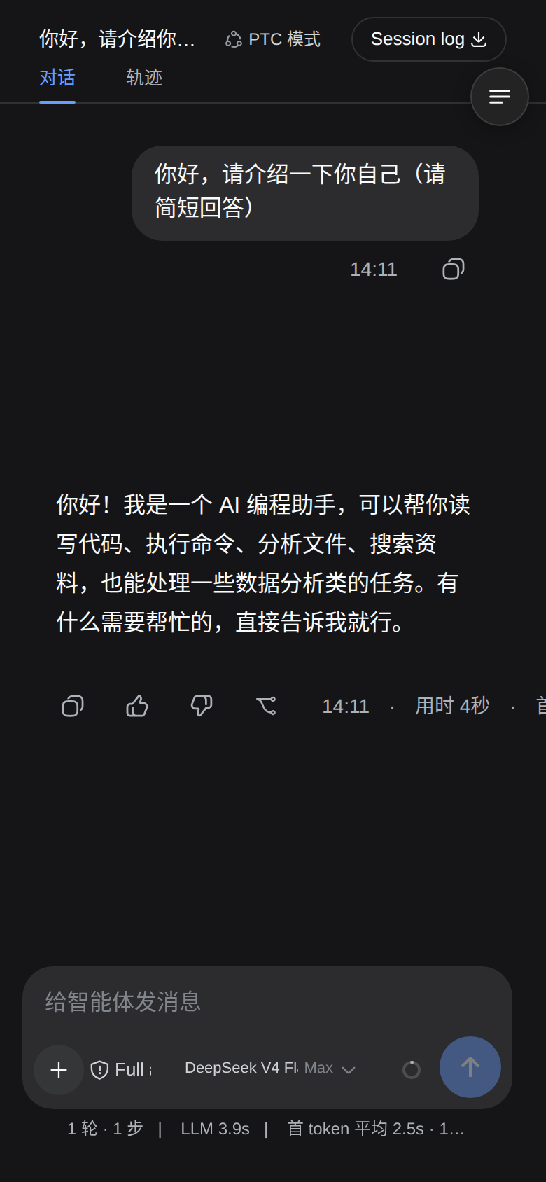
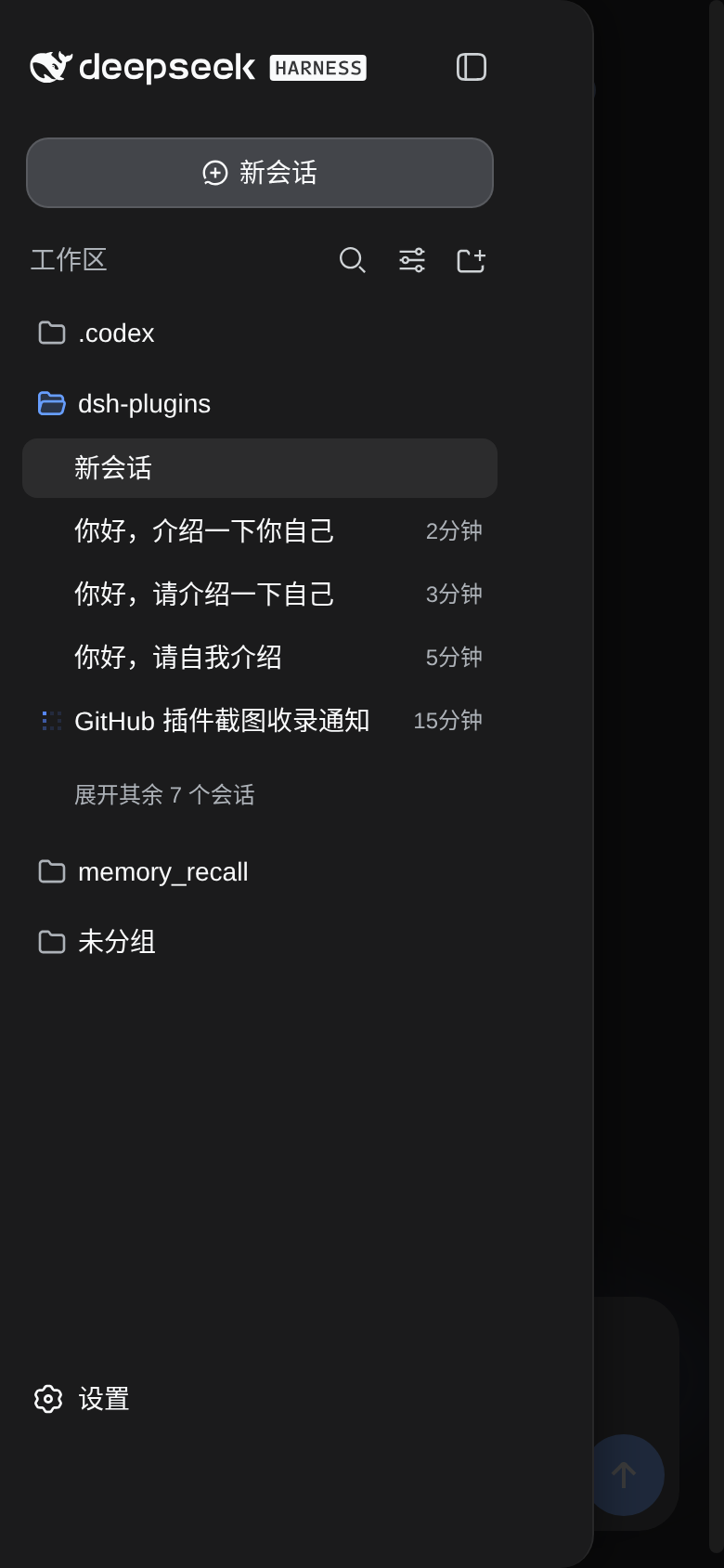
Mobile UI for the Web GUI on narrow screens: full-width responsive layout, overlay session drawer, 44px touch targets, safe-area support, and reading enhancements with zero desktop impact.
Manifest details
安装
dsh plugin --profile web add github:TZHR-invest/dsh-plugins#path:/packages/dsh-mobile-uiGitHub 源码安装:首次需按提示配置 allowBuilds 构建授权后重试
For install and environment setup, plus plugin development tutorials, see DSH community docs ↗
Screenshots
README
Mobile UI enhancements for the DeepSeek Harness Web GUI — turns dsh into a real mobile experience on phones (≤768px viewport):
- Responsive layout — hides the left icon rail, content goes full-width; session list opens as an overlay drawer
- Touch-optimized — 44px touch targets (iOS HIG), no double-tap zoom delay, no tap highlight, 16px inputs (prevents iOS focus auto-zoom)
- Reading enhancements — message spacing, bubble width, and helper text (tool rows / context-injection / status stats) scaled for small screens
- Right-top menu — the drawer (new session / sessions / settings) opens from a floating round button
- Safe-area aware —
env(safe-area-inset-*)support for notched displays - Zero desktop impact — every enhancement lives inside a
max-width: 768pxmedia query
Install
# from the plugin source directory
bash install.sh            # install (idempotent)
bash install.sh --restart  # install + restart dsh web (headless smoke test; aborts on plugin problems)
bash install.sh --uninstall  # remove completely
Or via npm:
dsh plugin --profile web add dsh-mobile-ui
What the installer does:
- Source kept at
~/.dsh/plugins/dsh-mobile-ui/ - Runtime copy at
~/.dsh/profiles/node_modules/dsh-mobile-ui/ - Web profile bundle wiring (
cordis.patch.ymlinsert)
Development
bash scripts/build.sh     # syntax + contract preflight (incl. classic-script check)
bash scripts/package.sh   # build dist/dsh-mobile-ui-install.tar.gz
Fast local iteration: copy to ~/.dsh/profiles/node_modules/dsh-mobile-ui/ and refresh the page (client plugins have an HMR channel — client.js edits apply on refresh).
How it works
- CSS layer: injects
style[data-plugin-css=dsh-mobile-ui], all rules wrapped in@media (max-width:768px)— desktop loads none of it - JS layer:
matchMedia-driven; on narrow screens the main grid goes single-column, the sidebar is hidden and becomes a fixed overlay drawer with scrim - QA card (
ask_user_question, Mbwy4a component): JS detects the card and turns its composer seat into a full-height floating panel — no:has()dependency (works in WeChat/X5-style engines). The card's ownmax-heightis lifted and its body stays the single scroll container, so long option lists scroll with a finger on every device; the footer button row wraps when narrow, so the submit button is always visible - Composer action row = two lines (2026-09-11, settled over two rounds of user feedback): line 1 holds the tools (
+/ attach / access mode) then the context ring and send pushed to its right edge; line 2 is the model trigger alone, spanning the full width. ⚠️ The first two-line attempt (tools alone on line 1, model + context + send on line 2) was wrong: it left 183px of dead space at the end of line 1 (measured at 412px) and the user immediately spotted it as "an empty patch up there". Lifting the context ring and send onto line 1 fills it (183px → 8px). Implemented withdisplay:contentson the trailing group so its children become direct flex items of the row, thenorderfor visual sequence andmargin-left:autoto push the last two right — pure CSS, no DOM moves (relocating React nodes throwsremoveChildon re-render). Two lines are required, not cosmetic: the full model name (commandcode/deepseek/deepseek-v4.1-flash= 40 chars ≈ 225px) physically cannot fit on one line inside a 390px viewport — the row has 332px of content width and the tools need 120px, leaving the model trigger ~61px (10/40 chars, measured). Wrapping lets it take 218px at the same viewport (38/40 chars) and the full name from 400px up, at the cost of row height 52 → 90px. The access-mode button always shows its shield icon plus its text (@container (min-width: 170px), judged on the row's real width); a clipped model name always uses a real ellipsis. - Composer row visual consistency (2026-09-11, from the user's "the heights don't match, it looks off" report): upstream ships six different control heights (add 28 / PermissionSelect 28 / model 28 / ContextMeter 28 / primary 34) and our own earlier patches had left a 36/40/44 mix with three font sizes (model 11px / access 13px / context 10px). Everything is now 44px tall with a 12px font (which also satisfies the iOS HIG minimum touch size — measured:
+/attach/access were only 36px), the primary button's upstreamtranslateY(-2px)is cancelled (a single-line-era optical compensation that pushed its centre 2px below its row), and the access-mode button gets the same round solid background as+/attach (upstream renders it as a background-less compact trigger, which looked like a missing piece between two round buttons). Invariants: exactly two lines; within a row every button is the same height, the same font size, and their vertical centres spread ≤1.5px; and no line may end in more than 60px of dead space (the quantitative guard for that "empty patch"). ⚠️ One more subtlevty: the UA default for<button>istext-align:center— once the model name spans a full line, centring makes the text start at x=69px instead of aligning with the+button above, sotext-align:leftmust be explicit (the old layout never exposed this because the label's width exactly equalled its text width). ⚠️ This surfaced a fourth word-root leak: the message flow contains no[class*=tools]at all (onlyxzv4MW_actions/TS9iAW_actions), so the old[class*=scrollBody] [class*=tools] button{min-height:36px}was really hitting the composer'suV2eYG_toolsand crushing+/attach/access to 36px — the actual cause of "row 1 is 36px while row 2 is 40/44px". It is now scoped to[class*=flowItem], so message-flow buttons stay 36px and composer controls 44px. Never fake a single line with "no-wrap + shrink": upstream group buttons carry a non-compressiblemin-width: 44px, so a narrow row cannot resolve by shrinking and simply overlaps (the original bug: at 390px the model trigger covered the context ring by 4.3px and the access-mode button covered it by 5.7px). - Regression probe (repo checkout only — the npm package ships just the runtime bundle):
python3 tests/mobile-layout-probe.pydrives a real headless Chromium (upstream CSS + real DOM nesting + the actual plugin bundle) across viewports, asserting two families of invariants: for the QA card — "option list scrolls / last option reachable after a real touch swipe / submit always visible / the fixed top-right menu button does not overlap the card"; for the composer row — "no two controls overlap / nothing spills past the card's right edge / every control is hit-testable / the access-mode icon and its text are always visible / the model name keeps at least 120px so it never degrades back into a sliver / a clipped model name uses a real ellipsis / icon, text and chevron are vertically centred". Exit code 1 on regression. - ⚠️ The most dangerous pitfall in this plugin: word-root selectors (three separate silent breakages on 2026-09-11). Upstream's
_7KE1Ra_triggerLabel / triggerIcon / triggerEffortall contain "trigger", so a bare[class*=trigger]hits them too: withdisplay:flexthetext-overflow:ellipsisis ignored (flex containers ignore it) and the model name is cut mid-character; withmin-height:40pxthe label is stretched to full row height and its text hugs the top, so the chevron looks like it dropped to another line. Always narrow tobutton[class*=trigger], and keep ellipsis ondisplay:block. Likewisebutton[aria-label*=访问模式] span { display:none }hides the shield icon as well (it is a span too), leaving a completely blank button — hide only[class*=triggerLabel]and keep the icon permanently visible. Two more rules it guards: never override the card body'soverflow(that is exactly what broke scrolling before), and hide the floating menu button whenever the question card is open (it sits attop:48px; right:12px, right on top of the card title). Related: amin-widthfloor on the trailing group's content is harmful —flex:1 1 0+min-width:0+justify-content:flex-endspills children leftward over the tools group once the box is narrower than its content minimum (measured: 9px at 365px viewport withmin-width:96px), so express "the model name should stay readable" some other way.
Maintenance notes (important)
- dsh frontend class names are build artifacts (hash prefixes). After a dsh upgrade, if selectors break:
- Verify
body.dsh-mobile-uiand#dsh-mobile-menu-btnexist in the console - Breakage usually hits layout classes (
[class*=frame]etc.) — adjust CSS/JS to the new prefix - Re-run
bash install.shafter fixing
- Verify
- Layout detection uses structural heuristics ("3-column grid + 56px first column"), not hard-coded class names, and buttons prefer
aria-label— this tolerates class-name drift - All DOM work is try/catch wrapped; any failure degrades silently (CSS layer still applies)
- Never move React-rendered DOM nodes with JS (
insertBefore/appendChildonpXSMma_rootetc.): React's fiber tree still records the old parent, so a re-render throwsremoveChildNotFoundError and the whole conversation view unmounts (blank page). Express every layout need in CSS (flex / order / :has) — the hero title pinning and the QA card are pure CSS for this reason.
Rollback
bash install.sh --uninstall + restart dsh removes everything (no residual styles/DOM).
License
MIT. Chinese documentation: README.zh.md
Part of dsh-plugins — a small monorepo of DSH plugins: dsh-lan-gateway, dsh-vision-tool, dsh-mobile-ui.
Related plugins
dsh-web(原 dsh-web-ui)
 zhu1090093659
/dsh-web-ui
dsh-web(原 dsh-web-ui):任务看板、git 图、右侧面板、远程移动端 UI、桌宠、实时 token 统计与皮肤中心的全家桶。仓库已更名 zhu1090093659/dsh-web,根目录声明 dsh.bundle.patch,支持根 Git 入口安装。
dsh plugin --profile web add github:zhu1090093659/dsh-webdsh-web-all 聚合包(原 dsh-web-ui-all)
zhu1090093659zhu1090093659/dsh-web-ui/packages/dsh-web-ui-all
旧整包路径 packages/dsh-web-ui-all 已随仓库更名 dsh-web 迁移:现聚合目录为 packages/dsh-web-all,npm 聚合包 @linxin666/dsh-web-all。与总仓根 Git 入口是同一产品的两种整包方式,不重复计数。
dsh plugin --profile web add @linxin666/dsh-web-all@latestdsh-TUI
 ccch1mneyyy
/dsh-TUI
Claude Code 风格全屏终端 UI:像素鲸鱼顶栏、实时工作状态行、思考流式展开。
dsh plugin --profile web add github:ccch1mneyyy/dsh-TUIdsh-cc-tui
ccch1mneyyyccch1mneyyy/dsh-cc-tui
一个美观且实用的 Claude Code 风格 TUI 插件:像素鲸鱼顶栏、双流光大字、实时工作状态行、思考流式展开、双击 Esc 时间回溯、蓝白上下文进度条 + TPS 仪表。 零核心改动,纯插件挂载。安装插件即可启用,卸载后不会留下核心补丁。 献给钟爱tui的各位极客们 A beautiful, practical Claude…
dsh plugin --profile web add github:ccch1mneyyy/dsh-cc-tuideepseek-balance-whale-widget
 meteornox
/deepseek-balance-whale-widget
DSH 小鲸鱼余额挂件(DeepSeek Balance Whale Widget)
dsh plugin --profile web add github:meteornox/deepseek-balance-whale-widgetDSH-better-sidebar
 omdsh-dev
/DSH-better-sidebar
侧边栏完整工作台:内置文件渲染编辑、终端、Git 与子代理,支持三方插件注册新 Tab。
dsh plugin --profile web add github:omdsh-dev/DSH-better-sidebar